Quick calibration tip
We all know that calibrating our monitors is something that’s very important, right?
But how do we calibrate?
Well there is a lot of talk around the web about this and also a lot of problems that can happen when you do it wrong.
For example did you ever notice a difference in brightness between Lightroom and Photoshop?
In other words, the images in Lightroom look great but when you open them up in Photoshop they are a bit too bright and there sometimes is some banding in darker areas?
Chances are that you have a defective colorprofile for your monitor.
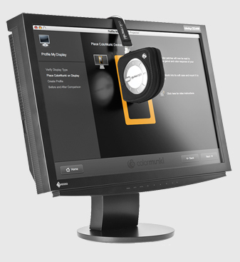
“But Frank I calibrated with a great color analyzer so how can that happen?”
With most analyzers you can set 2 different kind of profiles, a V4 and V2.
If you experience the brightness differences between Lightroom and Photoshop make 100% sure that you are using a V2 profile, if you use a V4 profile chances are that Lightroom is showing everything correct and Photoshop makes a mess out of it, the problem is that with most images people won’t see a lot of difference, but when you open up something that’s really dark and barely has detail in Lightroom you will find out that in Photoshop there is a lot more detail, this is when you know that there is a problem. Now check your software settings and make sure that you are using a V2 profile. You can find this in the preferences or settings.
Other settings I use for photo editing :
Gamma 2.2
Colortemp D65
Brightness 120-130cdm
Profile V2

That’s helpful Frank. On a different note, you are a great advocate of Passport Colour checker. I read somewhere that X-Rites Passport Colour Checker has a life of 2 years. After that colours begin to fade. What’s your experience?
It’s pretty accurate, but it depends on where you use it, studio only it will survive longer than out in the sun.